Stop Picking Font Sizes at Random: A Practical Guide to Type Scales
Most interfaces accumulate font sizes one ad-hoc decision at a time — 13px here, 15px there — until nothing relates to anything. A modular scale replaces all of those decisions with one ratio. Here is how they work and how to ship one in CSS.
In this article
Open the stylesheet of any project older than six months and count the font sizes. Ten? Fourteen? Somewhere in the codebase there is a 13px, a 15px, and a 17px, each added by a reasonable person solving a local problem — and collectively producing a page where nothing quite relates to anything else. Readers can't articulate why it feels off. It just does.
Typographic scales fix this the way a musical scale fixes noise: by limiting the choices to ones that relate.
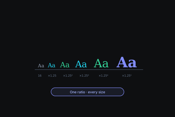
The idea: one ratio, every size
A modular scale starts with a base size — your body text — and multiplies by a fixed ratio to get each next step up, dividing for steps down. Base 16px with a 1.25 ratio gives 16 → 20 → 25 → 31.25 → 39.06 → 48.8 → 61. Every size on the page is now a power of the same number, which is why scaled type feels coherent even to people who never consciously notice type.
The ratios have musical names because the math is literally the same as musical intervals — frequency relationships that sound consonant turn out to look consonant too:
- Major Second (1.125) — quiet, dense; the right register for dashboards and data-heavy UI where headings should organize rather than announce.
- Minor Third (1.2) and Major Third (1.25) — the workhorses. Enough contrast to establish hierarchy, restrained enough for products. When in doubt, start at 1.25.
- Perfect Fourth (1.333) — confident editorial contrast; where marketing sites and long-form reading start to sing.
- Golden Ratio (1.618) — dramatic. Two steps up from 16px is already 42px. Beautiful for sparse, poster-like pages; unusable for dense ones.
The practical rule: the more text-dense the interface, the smaller the ratio. Our Typography Scale Generator renders every step of any ratio live, which makes the differences visible in a way tables of numbers never quite manage.
Shipping it: custom properties
The output that actually belongs in a codebase is a set of CSS custom properties:
:root {
  --text-sm: 0.8rem;
  --text-base: 1rem;      /* 16px */
  --text-lg: 1.25rem;     /* 20px */
  --text-xl: 1.563rem;    /* 25px */
  --text-2xl: 1.953rem;   /* 31.3px */
  --text-3xl: 2.441rem;   /* 39.1px */
}
Two deliberate choices in that snippet. First, rem, not px: rem respects the reader's browser font-size preference, so someone who has set their default to 20px receives your entire scale proportionally larger. That is an accessibility feature px silently deletes. Second, names, not numbers: --text-xl survives a rescale; --text-25 does not.
Once the variables exist, the enforcement rule is social, not technical: no raw font sizes in components. A new size means a new step on the scale — a design conversation — not a one-off number.
The fluid upgrade: clamp()
A 49px heading that is perfect on a desktop is oppressive on a phone. The old fix was a ladder of media queries re-declaring every heading at every breakpoint. The modern fix is one declaration per size:
--text-3xl: clamp(1.953rem, 1.953rem + 0.61vw, 2.441rem);
Read it as: never smaller than the first value, never larger than the last, and scale smoothly with the viewport in between. Type resizes continuously with the window — no breakpoints, no jumps. The generator emits this form too, tuned so each size bottoms out at 80% of its target on small screens.
Line height: the inverse rule
A scale for size solves half of typography's consistency problem; line height is the other half, and it moves in the opposite direction. Body text wants roughly 1.5–1.7 — room for the eye to find the next line. Large headings want 1.1–1.2 — at 49px, a 1.6 line height turns a two-line headline into two unrelated banners drifting apart. If you take one line-height rule from this post: as size goes up, line height comes down.
Retrofitting an existing project
Greenfield projects can adopt a scale in an afternoon. Existing ones need triage:
- Inventory — grep for
font-sizeand list every distinct value. The number will be embarrassing; that's normal. - Pick the nearest scale — choose a base and ratio whose steps land close to your most-used sizes, so most text barely moves.
- Map, don't perfect — snap each existing size to its nearest step. A 15px that becomes 16px and a 22px that becomes 20px are corrections, not regressions.
- Migrate by surface — one page or component family at a time. A half-migrated codebase with variables is still strictly better than a fully consistent pile of magic numbers.
The mistakes that undo a scale
Having watched scales succeed and fail across projects, the failure modes are consistent:
- Scaling the body text. The base size is the anchor — it was chosen for readability, not hierarchy. Teams that "bump the base to 17px so everything gets bigger" have changed reading comfort sitewide to solve a heading problem. Adjust the ratio or use a higher step; leave the anchor alone.
- Skipping steps for drama. Jumping from base straight to 3xl because 'lg' didn't feel bold enough breaks the very relationships the scale exists to create. If adjacent steps don't contrast enough, the ratio is too small — change it once, globally.
- Too many steps in play on one screen. A view using six different sizes has no hierarchy at all — hierarchy is contrast, and contrast needs scarcity. Two or three sizes per screen, plus body, covers almost everything well-designed.
- Forgetting the smaller-than-body sizes. Captions, labels, and legal text need steps below base just as much as headings need steps above. A scale that only goes up pushes designers to invent 13px by hand — and the whole accumulation cycle restarts.
The whole exercise — choosing the ratio, previewing it at real sizes, exporting the variables — takes minutes with the Typography Scale Generator, and like every tool on this site it runs entirely in your browser. Pair it with Color Forge and you have the two foundational token sets of a design system, generated without an account or an upload anywhere in sight.